
Embed code for Infographics:
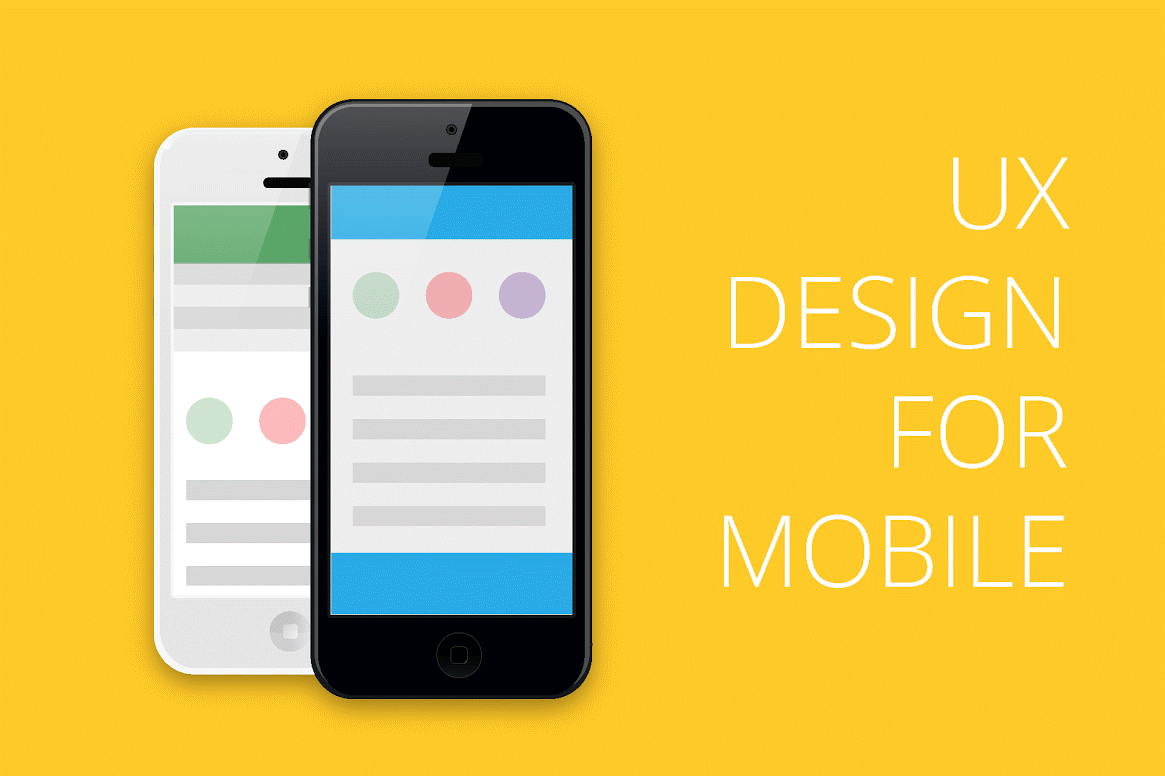
<a href="//internetdevels.com/blog/ux-design-for-mobile" title="UX Design for Mobile — Infographics" target="_blank"><img src="http://store.internetdevels.com/i/c358a611b6/1667x4550-ux_design_for_mobile.png" alt="UX Design for Mobile — Infographics"/></a>
Smart phones have become an integral part of our lives. Needless to say how popular they actually are. It’s a well known fact that the number of people accessing the Internet using cell phones has overtaken the number of those doing it via desktops. Thus, mobile web design deserves a lot of attention and consideration.
Crucial differences: mobile design vs desktop design
An impressive mobile UX design requires the same and at the same time different approaches compared with a desktop design. If you want mobile users to have fun, enjoy their experience and stay on your web-page, try to stick to these rules:
- Content prioritization. Never limit the content users need to read, as it leads to poor user experience and ultimately, they are not satisfied and leave the page without any actions.
- UX Interaction. Call-to-action buttons, links or any other navigational components should be made handy, so that visitors can choose any elements without using a mouse. It is quite difficult to pick the link or hypertext on a touch screen, therefore generate a unique and impeccable design, providing an extremely convenient user experience.
- Less Text and Graphics. Loading shouldn’t take a lot of time, so be careful with images and any other type of graphics. Bear in mind, a mobile screen is much smaller than that of a desktop, thus you should avoid components of a large size.
Identify user's needs
- Review of website analytics. What kind of content has been viewed on a desktop or mobile, and what words or phrases have been used to find the content needed?
- User investigation. An analysis of visitors’ activity when browsing a page.
- Frequently requested information. Research of the information inquired.
Android vs IOS and other mobile operating systems
According to the data issued by the International Data Corporation (Worldwide Quarterly Mobile Phone Tracker), smart phone users prefer Android to iOS, Windows Phone and other mobile operating systems. Android dominated the smart phone market with a share of 82.8%; iOS - 13.9%; Windows Phone - 2.6% and other - 0.7%. You see, there is a significant difference between Android and iOS. So, taking into consideration these stats, for the most part, UX designers have to adapt all design components for the Android operating system.
Highly functional navigation
People are accustomed to their desktop website navigation, as they have been using it for a very long time. For this reason, try to plan and eventually set it up for mobile in such a way that it will resemble desktop website navigation. The rules concerning the mobile navigation are similar to those of a general web design. An excellent UX design is simple, direct, unadorned; and contains high-quality images, prominent search features and call-to action buttons. All of these characteristics of the desktop web design should be adopted by the UX design on mobile phones.
Avoid redundancy
And, above all, remember that your web-site should be distinct and clear, free from unnecessary images, redundant buttons or guidelines. As we have already mentioned, the screen of the smart phone is much smaller, thus, do not overload your page with images and keep it as simple as possible.
Ending
In general, every single point stated above really matters, and if you lose sight of the one or two, you might lose your clients and visitors. Let’s summarize the key factors: crucial differences between desktop and mobile design, identifying user’s needs, choosing most popular mobile operating systems, providing seamless navigation, and omitting redundant things. Now that you know some basics of mobile UX design, get down to work!